How door handles, door leaf & floor fit together
Doors connect rooms - and are often the focal point themselves. Coordinating the door, handle and floor creates visual calm and a harmonious overall look. This article shows you how to use functional elements in a targeted way and not leave the design to chance.
Understanding the interplay: Why doors are so important in terms of design
A door not only separates rooms. It is also a surface, a line, a surface - and an interface. It catches the eye, it is touched every day. Together with the floor, it forms an axis in the room. The door handle interrupts this surface, directs the eye, provides impetus.
The handle connects hand and space. It is not simply used - it is felt. Shape, surface, material: all this works together with the door leaf and floor. If you consciously combine them, you get more out of this connection. The door becomes part of the room concept, not just a passageway.


Wood, concrete, vinyl - which floor goes with which door?
The floor is set - often early on in new builds, but usually remains in existing buildings. Anyone planning doors should therefore think about the floor.
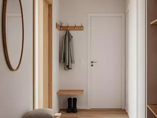
Light-colored floors appear open, airy and light. A light-colored door blends in seamlessly. The area appears large. If you like contrasts, use a dark door to create structure. Dark floor and white door: a strong classic.
Warm or rustic wood looks call for coordinated tones. Grey lacquered door leaves look harmonious here. Black also works if the furniture and wall pick up color.
Concrete look, tiles, exposed screed: these materials require calm in the door design. Clear glass or pure white set the right accents.
Material worlds: Stainless steel, brass look or black on various door leaves
The door handle changes the door. It is small but striking. Stainless steel looks functional and clear. It remains restrained on white or gray. On glass, it emphasizes the technical line.
A brass look, on the other hand, brings warmth. It develops depth on dark wood. Black also complements dark surfaces - or contrasts with light-colored door leaves. Both work. The decisive factor is: What do I want to emphasize?
Modern shades such as velvet gray or graphite black and cashmere gray blend in. They look matt, quiet and unobtrusive. In urban interiors or minimalist concepts, they complement the line without breaking it.
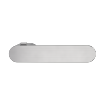
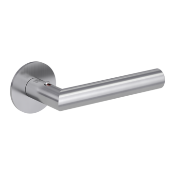
Design ideas from the Griffwerk range:
- AVUS One: striking, clear, timeless
- LUCIA PIATTA: flush, angular, understated
- METRICO PROF: graphic, reduced, precise
Creating color harmony - or deliberately breaking it?
Tone-on-tone combinations create a sense of calm. The door leaf, handle and floor remain in line. This works particularly well in smaller rooms or with an open floor plan. The elements do not disappear - they appear restrained.
Contrasts create tension. Black handle on a white door? Sure. Brass on anthracite? Striking, but elegant. The important thing is that the contrast must be intentional - not accidental.
The style of living provides orientation.
- Scandinavian: white, wood, stainless steel.
- Industrial: exposed concrete, metal frame, black.
- Country house: natural tones, brass, soft contours.
- Bauhaus: geometry, reduction, clear lines.
Tip: Don't think of colors in isolation: What works in context with furniture, light, wall color?


The big picture: thinking about doors in the context of furniture & walls
The door never stands alone. It is embedded in the room. Wall color, furniture materials, lighting conditions - everything plays together. A door that looks good in a catalog can appear strange in a real room.
Open-plan living concepts reinforce this. Doors are constantly visible - not only when they are closed, but also as a surface in the wall. Handles, frames, architraves: everything has an impact.
Anyone planning should consider adjacent rooms. Color gradients, visual axes, repetitions in the handle design. Floors that run into several rooms also require a consistent design language.
Avoid mistakes: This is what happens when the door and handle don't harmonize
Mistakes are quickly noticed - especially if they are in the middle of the field of vision. A shiny chrome handle on an oiled oak door leaf looks out of place. A rustic door with minimalist fittings breaks the style.
A common mistake: too many different elements. Three doors, three colors, three handle types - the room looks restless. Different materials that don't match also create tension.
What helps:
- Always check the fittings on site.
- Don't just decide online - feel, see, compare.
- Make a few well-considered decisions.


